Responsive Website Design
Responsive website design techniques explained in an article showing how websites can work on hand-held device such as smart phones and tablets. Ever wondered how you can make your website as easy to use on a smart phone or tablet as it is on a desktop computer? This article about how we approach responsive website design is just what you're looking for.
Historically websites were built to a fixed width, taking into consideration the most commonly used screen sizes. From around 1994 to 2008 screen sizes were ranging from around 800 pixels to 980 pixels on 16 inch monitors so we were fairly sure that if we built our websites to within that width the content would be visible without having to scroll left and right. With the advent of technology that allowed for the build of cheaper flat screen monitors we began to see monitors well above 1,000 pixels. For a short time web designers toyed with 'elastic' layouts that resized according to the available screen width. Realistically these websites had a tolerance of around 200 pixels - anything more than that and they would become mess.
Building Websites for Hand-held Devices
When we first started browsing the internet on smart phones and tablets we were zooming in and scrolling left and right, up and down to get to read the content - not a good experience. As an initial solution, web designers began using a piece of code to try to detect the devices being used to browse their site. This worked to a certain extent - a different version of the website could be presented if it was detected that the site visitor was using an iPhone for instance. As more devices came along and their screen sizes varied this method became inadequate and over complicated - imagine having to create 3 or 4 versions of a website for smart phones and tablets introduced by many different manufacturers. This isn't a good situation either in terms of the amount of work involved or the duplicate content created in carrying out this work.
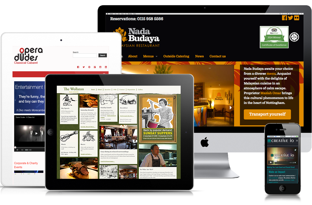
So how do we present a website using the same content for screen sizes that range from around 300 pixels wide to well over 1,400 pixels wide?

The same website displayed across several devices - the idea being that the content is not duplicated, is readable and navigable.
The answer is relatively simple but the implementation of it is a little more involved. We design 'mobile first'. When you think about it, it's the only way to go. If you know your text is readable by scrolling only up and down and your site is navigable at the same time, even on a screen that's just a couple of inches (say 50mm) wide then you're on your way to creating a good visitor experience over a range of devices. But what about larger screens? Simple - we prioritise our content so that is shuffles into the correct space on a large screen. We do this by using a column based grid to organise our content. Personally this is great news! Coming from a design background where column grids were used to design magazine articles, it's just like coming home!
Imagine your web page split into twelve columns with a space (or gutter) between each column. The width of the columns doesn't matter (as long as they are equal) - it is 'fluid' and the height is inconsequential for the moment.
Now think about the main title of your web page: You may want this to run across the entire width of the screen so using our column grid we simply 'tell' the web browser to put this content in twelve columns whether it is being viewed on a smart phone or a desk top compuer or a smart TV. Next on our web page we may want a paragraph on the left and an image on the right. That's great but on a smart phone that image is going to get quite small and the text may begin to break up or become scattered (i.e. not flow neatly around the image). One way to overcome this is to tell the browser that the text should take up six column widths on a large device but twelve column widths on a small device - do the same for the image, and on large devices the image will sit to the right of the text but on a small device the image will be 'stacked' under the text and take up the full width of the screen. This will leave our paragraph readable and the image visible at a reasonable size.
The Title of My Page - note that this sits in its own row and spans twelve columns
This is my paragraph of text sitting to the left of an image on a desktop computer and taking up six column widths.
On a smartphone or hand-held device this text will sit above the image and take up the full width available (12 columns).

By Chris Fickling